
Little Business
Helping an independent business management platform find its voice, structure its content, and bring its brand to life.
About
Little Business is an independent business operations and management platform aimed at helping small business owners run their work with clarity and efficiency. I was brought on to shape the content experience, define the information architecture, and design a visual system that communicated trust and accessibility.
Approach
The client needed a clear, intuitive digital presence that could organize a complex range of services and resources while appealing to busy, non-technical users. The existing concept lacked a cohesive content structure and visual language.
Research & Insights
I started with stakeholder interviews to uncover the business goals, customer pain points, and the “must-have” moments in the user journey.
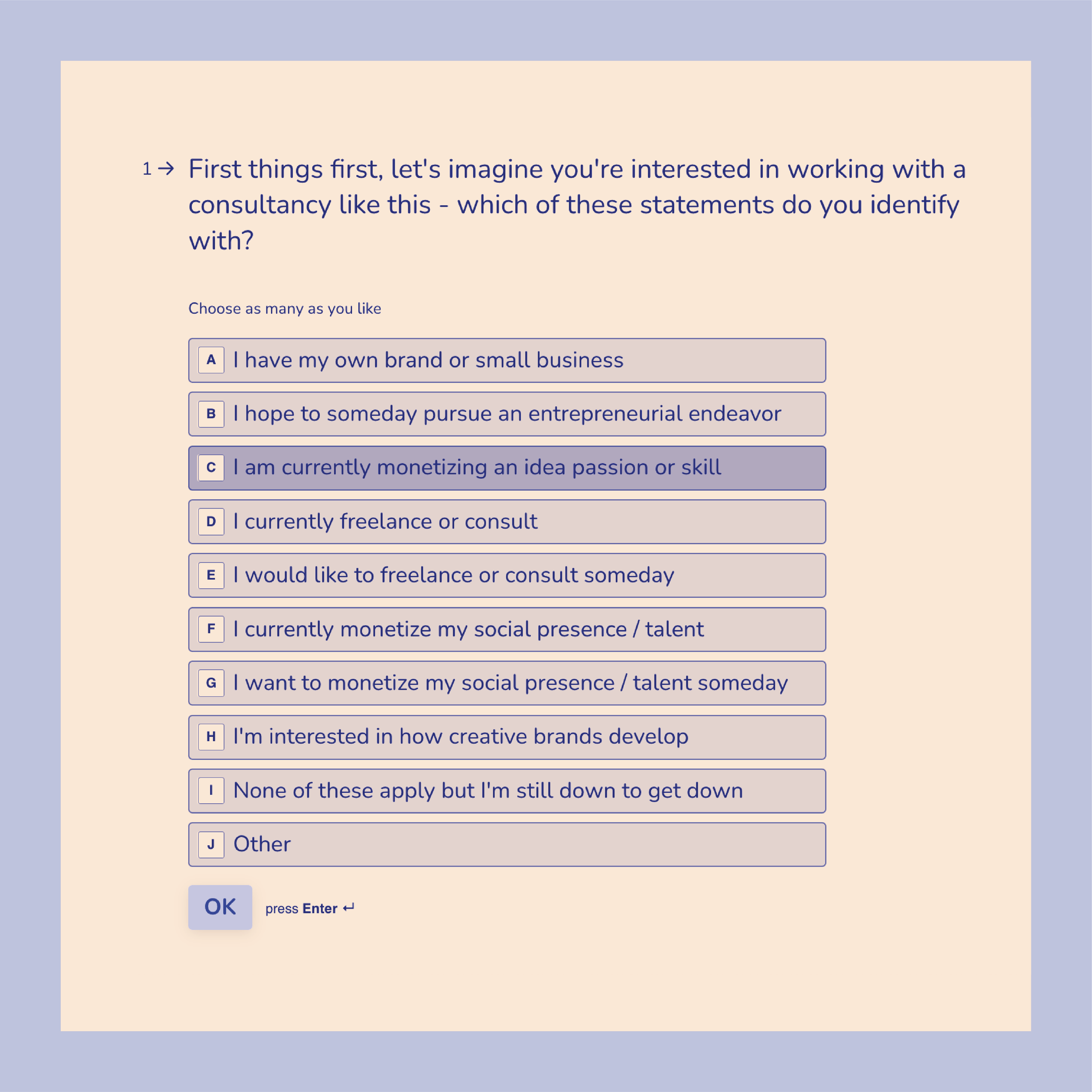
To broaden our perspective, I crafted a client questionnaire that went out to both existing and prospective customers. We approached this creatively, with many questions drawing parallels to familiar daily tasks, making it easier for participants to share candid thoughts without feeling led toward a particular answer. (View a sample of the questionnaire →)
This was paired with a competitor analysis that examined how similar service businesses organized their content, guided users to action, and differentiated themselves visually.
The result was a clear picture of the audience’s language preferences, trust signals, and navigation habits, forming the foundation for the site’s structure and tone.
Content Strategy
From the research, I developed a concise content framework that prioritized clarity and immediacy. I defined the tone of voice as approachable but authoritative, ensuring messaging felt helpful rather than overwhelming.
Each page was given a clear primary purpose, with supporting content structured to guide users toward the next step. Whether that was learning about services or getting in touch.
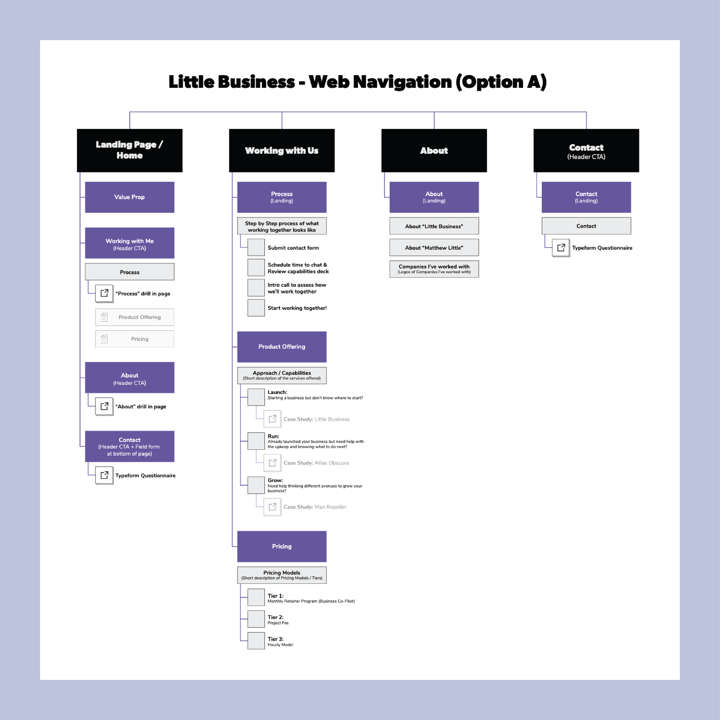
Information Architecture
Using the content framework, I designed a streamlined site map that reduced complexity and grouped related content into intuitive categories.
Page flows were mapped to align with user mental models, making it easy for visitors to scan, orient themselves, and reach their goals in as few clicks as possible. This also included strategic placement of calls-to-action to encourage engagement without disrupting the browsing experience.
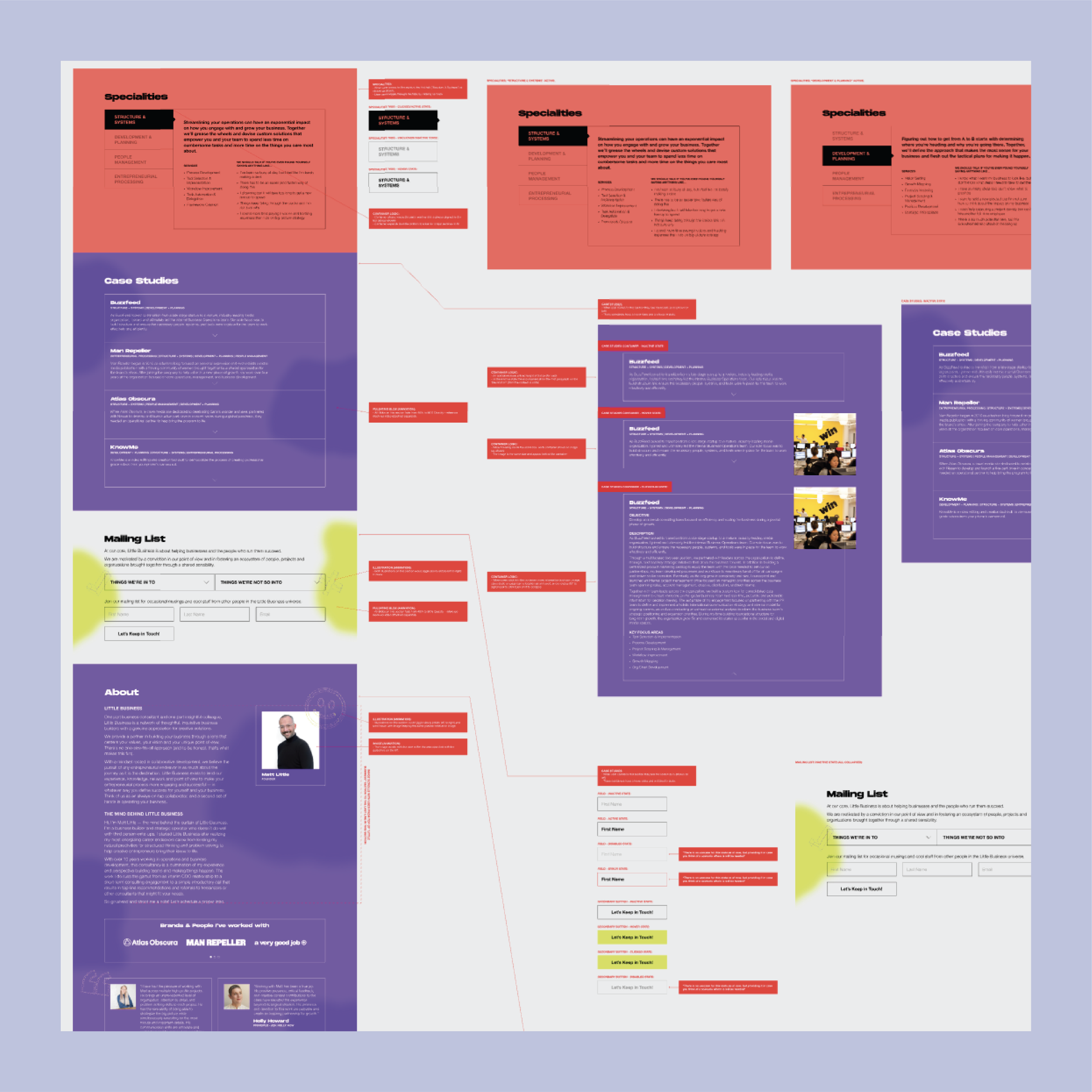
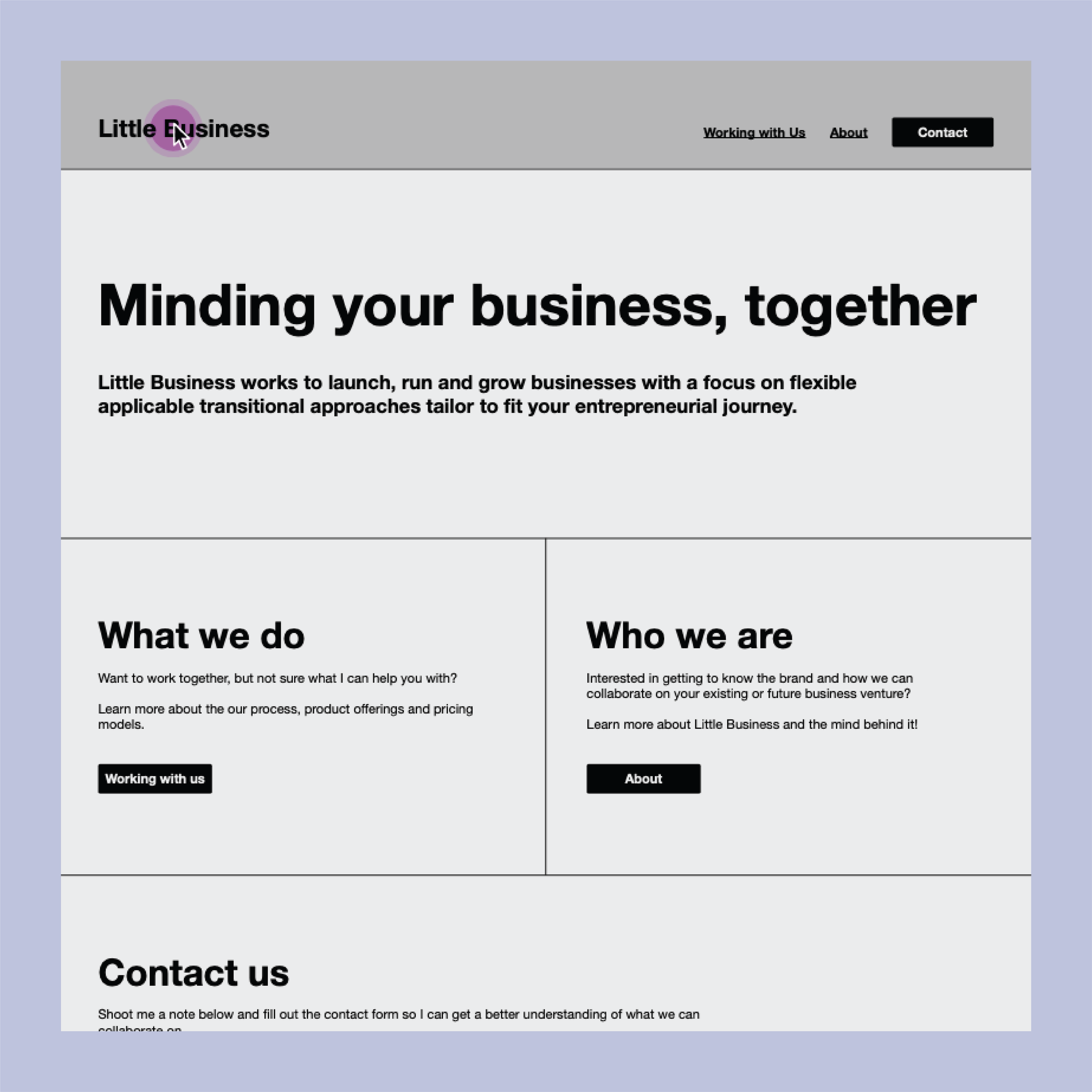
Visual Design
The design system was crafted to balance professionalism with warmth, while supporting the brand’s goal of being both credible and relatable. I paired clean, modern typography with a soft, friendly color palette and simple iconography to break down complex topics.
The layout was designed for flexibility and scalability, then implemented in Webflow to ensure a responsive, mobile-friendly experience and easy client updates without the need for a developer.
Final Result
The result was a cohesive, user-centered site that communicates credibility while remaining friendly and approachable. The structure supports both quick scanning and deeper exploration, and the visual design strengthens the brand’s professional yet personable identity.
