
Chase Finn
Chase approached Moment with research on millennial spending and tasked us to come up with an innovative product or service that would cater to their needs.
About
Chase approached Moment with research on millennial spending and tasked us to come up with an innovative product or service that would cater to their needs.
The brief was open ended and required us to do extensive research to understand millennial spending patterns and habits along with the motivations behind their spending.
The project consisted of two phases which were each 6+ months long.

Phase 1
Consisted in digesting and understanding the secondary research that was passed on to us by Chase. This then helped inform the questions we were trying to get answered through first hand research (interviews, intercepts, Dscout, Online spending journaling, etc.)
Phase 2
We took all the learnings and findings we got from our research sessions and put all our findings together in the form of lo-fi product offerings and prototypes which we then used to do usability testing with. After narrowing down our product offering we went into a more hi-fi visual design research phase in which we wanted to identify the users’ favorite paradigm when navigating through their finances.
The project culminated in an online banking app catered specifically to millennials, helping them understand their spending habits by rating their purchases with emotions. This would then give them a comprehensive look at their spending and what drove them to spend more/less each month, so that they could have better control over their spending habits.

Initial Research
The first step was understanding our target user, Millennials. In order to get a better feel for their spendings we wanted to get a grasp on how they define themselves, what their passions are, what are the things they are working on changing for themselves, etc.
Research Goal
Going into the field research round, we wanted to uncover the unmet and unspoken needs of Millennials and identify Chase’s innovation opportunities to create a truly differentiated mobile banking product.
Process Overview
Our research began with the goal to find inspiration for the future of mobile banking by understanding Millennials and identifying trendsetters. We visited three distinct cities over the course of three days: Minneapolis, Nashville, and Washington D.C. These cities have emerging Millennial populations, no Chase representation, and encompass different geographies, political leanings, cultures, life stage expectations, and industries. At these locations we conducted an extensive research using the below approach:

ONE-ON-ONE INTERVIEWS
We conducted 30 interviews to understand what motivates and influences Millennials, by identifying their challenges/successes, understanding their hopes, fears, and thought processes.

INTERCEPTS
We wanted to understand how Millennials perceive themselves “in-the-moment” and learn more about their passions.

JOURNALING
We ran 12 journaling activities throughout the course of 3 days with participants all over the country to understand their behavior, emotions and priorities as they relate to money.

SECONDARY RESEARCH
We then gathered extensive research from sources like news articles, scholarly pieces and design briefs to help guide us.
Research Synthesis
To help guide us going forward on this project we created archetype cards representing the types of users we talked to. These are generalized representations of distinct user mind-sets, behaviors, and drivers.
We then identified user needs and turned them into problem statements that can help guide ideation by describing key user needs that were uncovered through our research.
These were then used to host a workshop with our stakeholders to identify key Value Proposition Statements that succinctly described the vision of this product.

Initial Findings
Following this initial research phase, we synthesized all of our findings and identified 3 problem statements encompassing key themes and basic needs all participants were looking for in life:

SELF ACTUALIZATION
Millennials seeking personal fulfillment need to feel empowered to grow and make a difference so they can continue defining their own happiness.
ESTEEM & BELONGING
Millennials who are working towards defining themselves need assurance in their decisions so they can feel confident and recognized for their contributions.
SECURITY & BASIC NEEDS
Millennials who need better control over their lives need to feel secure about today so they can prepare for the unexpected and also focus on the future.
These statements were used throughout the project to keep the design and research focused on our user needs. Following this synthesis, we came up with problem statements cards for each of these three buckets and hosted a workshop with our stakeholders in which we used our archetype cards and paired them against a problem statement card, so we could ideate potential solutions and opportunities for millennials needs.
Coming out of this initial ideation round we identified multiple routes we could take this product offering to. After synthesizing all of those ideas and putting a few together to come up with more fully baked ideas, we managed to land on two key value props:
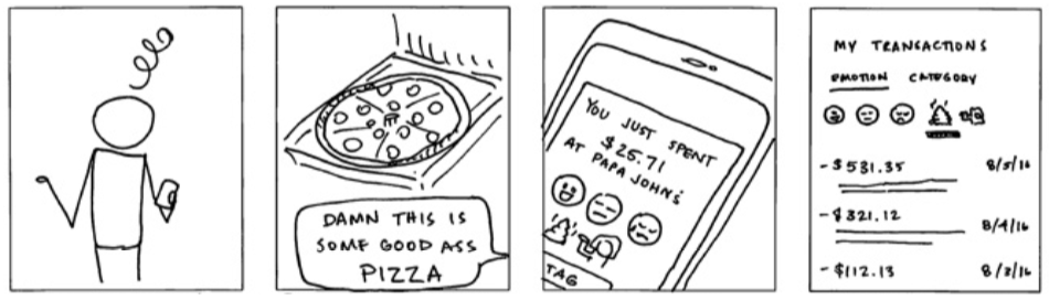
Concept 1: Pizza
“Have a greater control over my personal life and happiness”
Our service (i.e. financial emotions marker) connects emotions to finances, enabling Millennials to have greater control over their lives and personal happiness.

Concept 2: Dream Catcher
“Make informed decisions and safely explore other options”
Our service (i.e. personal goal compass) uses personal financial data to empower curious Millennials to make informed decisions and safely explore their options.
Concept Validation Testing
Using these two concepts we kicked off an extensive sprint-based evaluative research phase, in order to validate each concept and address key opportunity areas within these. During this research we were also looking to validate the key user needs we identified earlier, by testing our key concepts but also sprinkled in some secondary concepts within each value prop.
Research Goals
Going into the first phase of this testing round we wanted to understand the below:
Validate Pizza’s value throughout a full experience: rating transactions, spending insights, spending less recommendations, auto-save rules, and notifications.
Understand which rating model provides enjoyment and creates the least amount of friction.
Identify how participants expect to rate transactions: what they rate, where they rate, when they rate, and what prompts them to rate.
Identify participants’ mental model of how features are organized and relate to each other.

Process Overview
We created lo-fi key screens for both concepts (Pizza and Dream Catcher), in which users walked through simple scenarios, allowing us to collect information on how they were interacting with each product and helping us identify pain points in the process.
Examples of these scenarios involve things like rating your transactions by needs or wants or tying an emotion to each transaction. This was really informative to identify patterns and behaviors users were implementing to complete these tasks. It was also helpful to see what features and ideas they were drawn to and why.
Key Findings
SPENDING MENTAL MODELS
We identified two different, divergent ways of thinking about money that reflected participants’ expectations, behavior, and reactions to concepts.
One mental model values “needed” purchases over “wants,” and uses negative punishment to save.
Punish me for my “bad” spending behavior
Thinks of savings as a “punishment
Thinks of savings as a “punishment”
Views “wants” as “negative” purchases
Thinks having more “Needs” than “Wants” purchases is better
Correlates with those seeking security and basic needs
Recognizes saving could make them feel better
The other mental model values “wanted” purchases over “needs,” and uses positive reinforcement to save.
Reward me for my “good” spending behavior
Thinks of savings as a “celebration”
Views “wants” as “positive” purchases
Thinks having more “Wants” than “Needs” purchases is better
Correlates with those seeking self-esteem and belonging
Recognizes saving could make them feel better
We consistently saw that participants with one mental model had great difficulty understanding the other point of view. A key similarity is that they both recognize saving can be used to make them feel better. Interestingly, these perspectives also align with our two main user groups: those seeking security and basic needs or self-esteem and belonging.
RATING PURCHASES
When it came to rating their transactions, we asked users if they preferred rating their transactions by emotions or by categorizing them by need/want. Most users said that these two weren’t mutually exclusive, and they found that in order to get the most value from the app, they had to rate each purchase by emotions and need/want, so they could get the most comprehensive, accurate and consistent data.
Information Organization + Validation Testing
Through multiple rounds of iterations and testing, we identified a need and interest in attaching emotions to need/want purchases. This allowed users to understand their spending patterns and with this information they were more prone to change or celebrate certain spending behaviors.
After validating the success of our value proposition and identifying user’s interest, we had to start creating a more tangible lo-fi version of the app, to understand users behavior when going into their bank accounts. So we could identify their priorities when it comes to banking and how information is presented to them.
Research Goals
Going into this next phase of testing, we needed to understand 4 key things:
Identify the user's expectations and preferences when it came to app navigation and how information was being presented to them.
Identify what app features were most important to them when banking.
Identify what contextual information (emotion, need/want, category, time, weather, calendar, location) participant’s value when reviewing their recent bank activity.
Validate which interaction model aligns with the participant's process of rating transactions with need/want and emotions.

Process Overview
Using card organization exercises, we were able to identify the importance of certain features when it comes to your baking app. We also created a few different options of lo-fi prototypes using different navigation paradigms to understand what was preferred by the users when doing common banking tasks.
Key Findings
NAVIGATION PREFERENCE
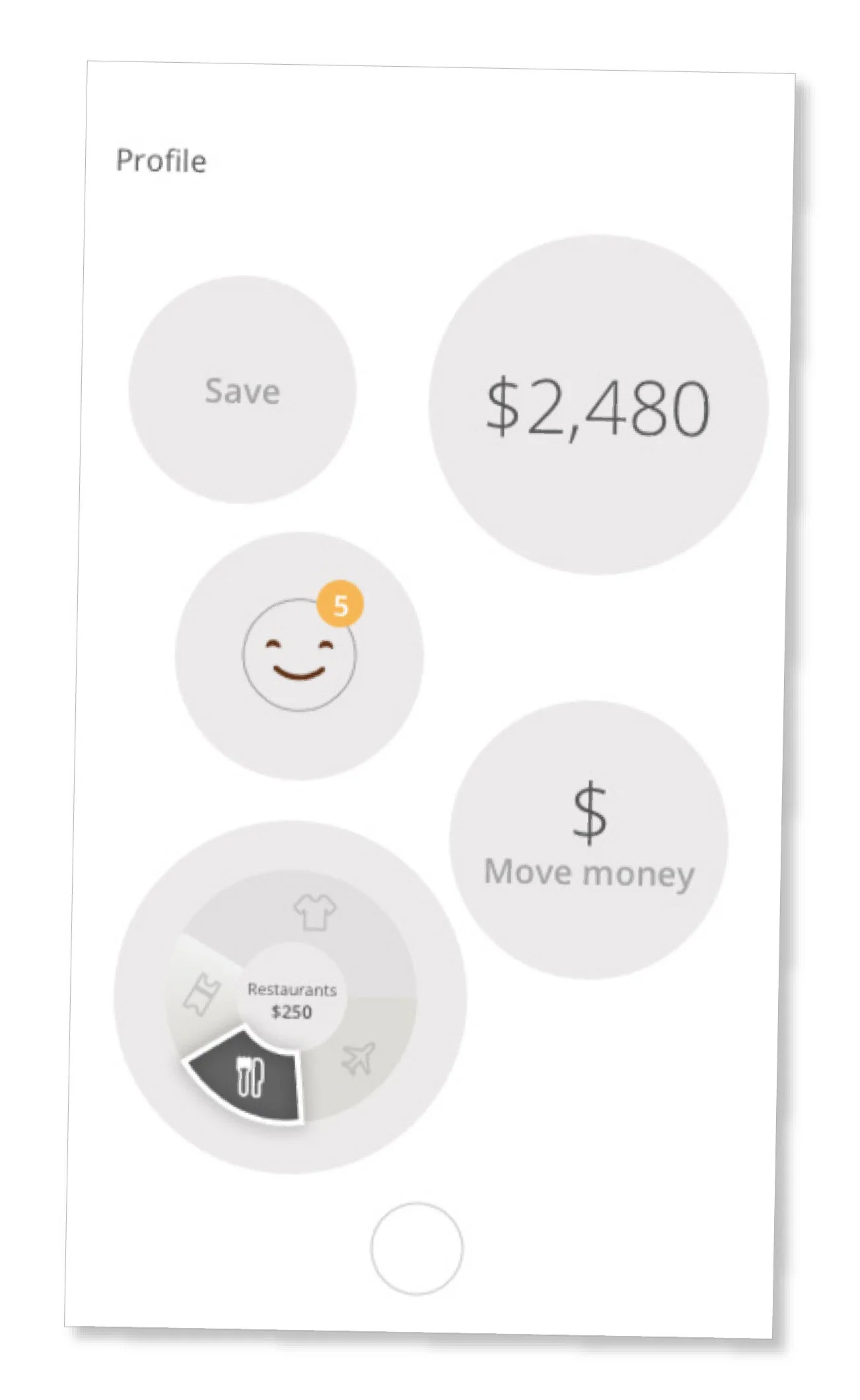
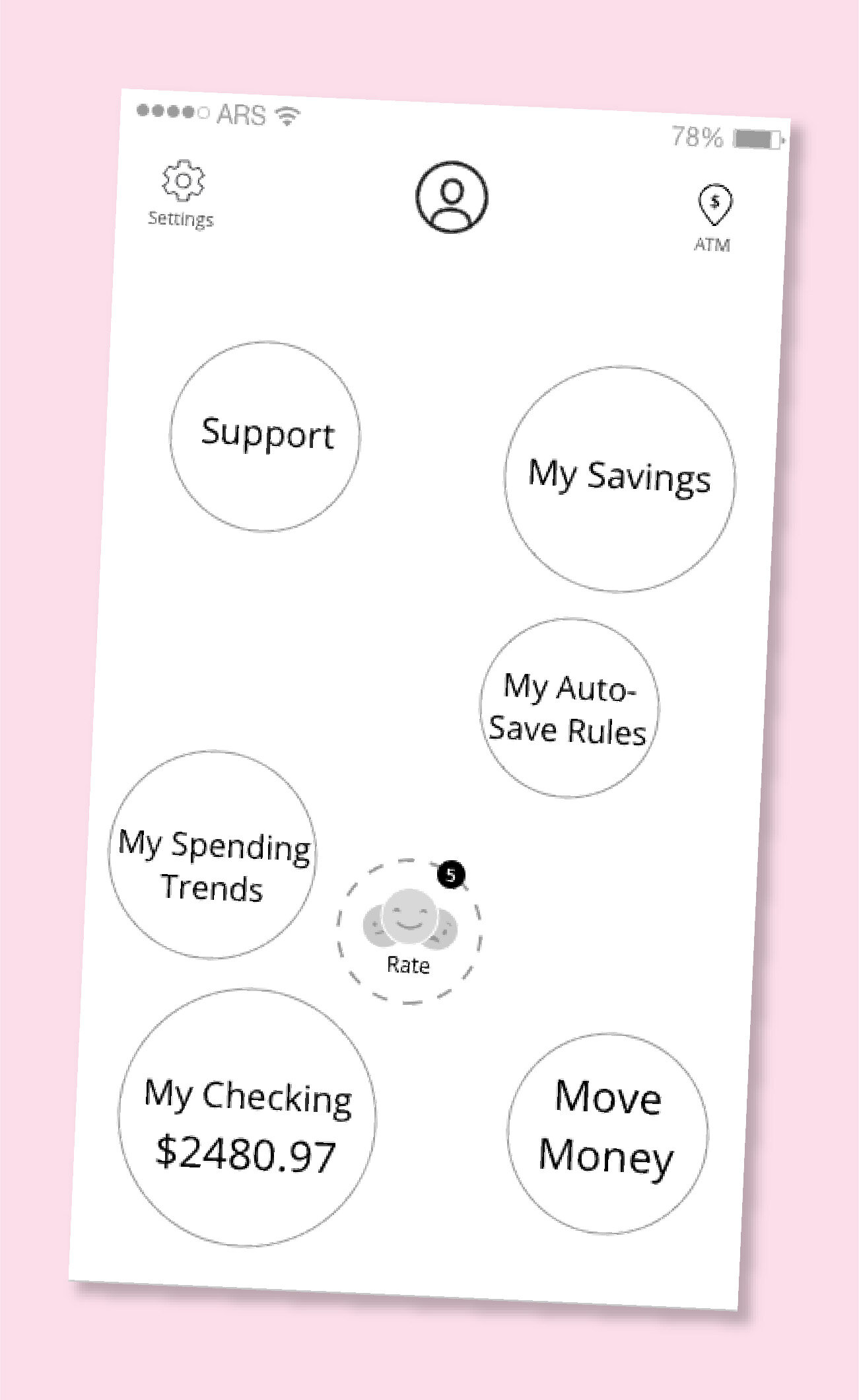
After going through multiple examples of information organization and navigation paradigms, participants preferred having a central dashboard that surfaces key functionality in a single screen and acts as a “launching pad” to other features within the app.
Participants appreciated having all features “on the same level.”
Participants found the unrestricted navigation to provide better orientation within the app.
The navigation felt unique and provided a greater level of enjoyment—many participants described it as “fun” or “like a game.”
Most participants would enjoy this navigation in their banking app, and considered it a way to differentiate the app from more traditional financial products.
FEATURE PRIORITIZATION
Based on this, we were able to organize banking app features from highest to lowest priority from the user’s point of view. This helped us identify what features needed to be fully built out first in order to keep testing the success of our value props. This prioritization also became crucial and necessary when scoping out our design sprints for the mid-fi and hi-fi versions of the app.
All participants identified these as having the utmost importance, and should be extremely accessible.
Account Balance
Transactions
Transfer (one time)
Most participants included these features in their must-have list of features for this app.
Deposit Checks
ATM Locator
Savings (Buckets)
Quick pay (P2P)
My Profile
Contact Us
Few participants thought it was necessary to include these features in the app.
Direct Deposit
Refer a Friend
Live-Chat Help
Protection & Security
Report Lost / Stolen Card
Travel Notice
Request Replacement Card
Almost no participants included these in their assessment of what’s necessary to be included in the app.
In-App Messaging
Bill Pay
RATING METHOD PREFERENCE
Users understood the importance of first identifying if a transaction they had made was a need or a want purchase, and then tying an emotion to them. When showing them different interaction models to rate their purchases, users gravitated towards common behaviors in dating apps such as swiping left for a sad transaction and right for a happy transaction. The most important things to consider when continuing to refine this feature were the following:
Participants needed contextual information provided per transaction to be able to accurately rate and categorize it.
Participants liked when the app prompted them to rate their recent transactions upon sign-on but liked having the ability skip this in case they were coming in to find time-sensitive information
Participants would like the app to start using AI to understand their spending and start sorting their recurring transactions based on how they rated them previously, but wanted the ability to edit these auto-rated transactions in case they were tagged incorrectly.

Feature Testing
After identifying the preferred navigation paradigm and continued testing and evolving of the rating interactions, we started building out a more robust app ecosystem. This involved building out and testing each section of the app separately to get feedback from users and understand the importance of each section, and how they thought each section should interact.
Research Goals
Going into this phase of testing, we needed to understand multiple things within each feature of the app. But the overarching things we were looking for were:
Validate that content being presented is successful and actionable.
Identify user’s expectations and preferences when it came navigating each section of the app
Understand the information participant’s needed in each section vs. what was a nice to have
Identify what features participants thought needed to interact with others in order to get the best banking results
Process Overview
Using lo-fi interactive prototypes we tested the below features of the app:
Home Page
Checking page (balance information, list of transactions, transaction detailed pages, etc.)
Savings page (balance information, list of transaction, money transfer options)
Autosave features (rule-setting for saving, recommended rules, insights and recommendations, etc)
Rating transactions (emotions, need/want)
Spending Trends (social element to the app to discover successful things other users had done to increase their savings and better their spending habits)
Rating/Spending Visualizations page (infographics based on in-app data collection to help users understand their spending habits)
This testing round was the longest, as we were testing each section separately and more than once. We would have weekly research sprints with 15 participants each, in which we would adjust our screens on a weekly basis based on our learnings to validate each section's success.
Key Findings
HOME PAGE
Participants liked seeing all available features in a single screen that acts as a “launching pad.”
Participants acknowledged there would be a learning curve with this new paradigm, as it would be the first banking app with this type of navigation, but were interested in this more concise way of showing an overview of information.
Most participants liked being able to see their checking balance on the home page
Some participants liked having the ATM feature on the homepage
Most participants expected to swipe out of detailed pages to get back to the home screen

SAVING MENTAL MODELS
From past rounds of research we identified two ways to understand money. One mental model (punishers) values “needed” purchases over “wants,” and use negative punishment to save. The other mental model (double joy) values “wanted” purchases over “needs,” and uses positive reinforcement to save.
Mental models impact the way in which participants receive and respond to content. Both mental models would accept “double joy” content.
Even though both mental models would accept “double joy” content, “punishers” also need “punishment” content in order to find the most value out of the app.

AUTOSAVE
Participants would want to create a savings rule based on spending because it felt like a new, exciting way to save money.
Participants enjoyed that this allowed them to save incrementally because they wouldn’t realistically take the time to do this manually.
All participants voiced excitement about the auto-save rule functionality and would set rules if they had this app.
Participants’ mental model (Double Joy or Punishment) affected the factors they would include in their auto-saving rules.
No participants wanted to use emotion to create savings rule, as they felt this would be too unpredictable for them to know how much money would be moving out of their checking account.

RATING/SPENDING VISUALIZATIONS
There was a relatively even split between those who wanted to interpret their information themselves and those who wanted help doing so.
Those who wanted help interpreting their information were most interested in visualizations and insights with a forward call to action.
Those who wanted to interpret their information themselves were most interested in raw data and recommendations and were the least interested in visualizations.
All of the participants seemed to be open to raw data and recommendations regardless of their preference on how they wanted to interpret their own information.
Insights need to be more actionable and feel personalized in order to be of value to participants.
Participants wanted to be able to explore their trends with multiple views (weekly, monthly, and yearly) in order to scrutinize recent spending in detail while also seeing how it fits into their larger spending trends.
Visual Design Testing
After several rounds of iterations regarding navigation patterns, content strategy, data visualization methods and more, we were able to synthesize all of our findings and narrow all the information down to create our first pass at the hi-fi version of our screens.
Research Goals
During usability testing we were looking to get input from participants on the below:
Brand and identity (i.e. what colors, design details, fonts, were participants most drawn to?)
Brand tone and voice (i.e. were participants interested in a more casual voice and approach or expected it to be more buttoned up?)
Usability and ADA compliance (i.e. we tested with participants that were blind, color blind or participants that needed voice assistance to complete tasks on the app.)
Visual hierarchy and level of importance for each feature (i.e. what things did participants want to be more prominent and what could blend more in the background.)
Process Overview
Using Hi-fi screens we conducted testing sessions in which we presented 3 different visual design approaches for the app (Direction L, M and J). We were not testing final designs, this was more to get a feel to what color palettes, typefaces, iconography, etc, participants were gravitating towards.
DIRECTION L

DIRECTION M

DIRECTION J

This testing also included ADA testing, where we introduced different variables that would make participants gravitate towards one of the concepts. We interviewed people that were color blind and blind. Allowing us to also test for bugs on our interactions and navigation paradigm when navigating through the app using the voice assistant.
After all this testing we were able to narrow down our visual design approach, and were able to make recommendations for the internal design team at Chase to put together the final screens and brand guidelines.
Key Findings
Overall, users felt the visual design of all three directions overpowered the innovative functionality of the app.
Users felt like the functionality embodies the brand values. So, the visual design should play a complementary role in communicating those values, not overpowering them.
The participants reacted negatively when they recognized that the visual design was “trying too hard” to cater to a young audience.
Participants saw the value of rating their transactions with emotions, but saw the visual designs as pushing the playfulness and fun too far.
Visual Design Recommendations
We recommended to use “Direction L” as a starting point for exploration and refinement. Apply successful aspects from Directions M and J to make a successful combination of all 3 concepts.
Clarify hierarchy and organization of information in the transaction section, to make it easier to scan and understand the content.
Establish an expandable type system and consider varying weights to communicate hierarchy.
When choosing a final typeface, make sure it has an extensive number system (superscript and standard).
Clarify interactions within the app with visual cues, helping users know what is editable, tappable, etc.
Consider an alternative color palette and textures. Current dark palette makes the type hard to read at times.
Final Deliverable
After all this extensive research, we were able to keep evolving our design from simple sketches to our first pass at visual designed screens. All these findings were passed on to Chase for them to have their internal design team put together the final version of the app.
Chase launched our concept “Pizza” under the name of “Chase Finn” in the Summer of 2018.

Please note everything shown here is property of J.P. Morgan Chase / Moment Design ©